
Groww
Transforming Groww's onboarding to turn new users into confident investors
Background
Investing is complicated, but it doesn't have to be—guiding beginners with clarity and confidence.
Groww, an India-based investment platform, sought to make investing accessible for beginners. While participating in Y Combinator and preparing for Investor Day, Groww faced challenges with user drop-offs during onboarding and low conversions to active investors. This redesign ultimately helped Groww secure Series A funding from Sequoia, propelling their growth and market position.
Role
- Lead Product Designer
Team
- CEO
- CTO
- Head of Product
- 8 Engineers
Responsibilities
- Research
- Interaction Design
- Prototyping
- Usability Testing
- Visual Design
Problem
Users are dropping off during onboarding because the process feels cumbersome and unclear. For those who complete it, the lack of guidance leaves them unsure about taking the next step, reducing their confidence to invest.
Solution
Simplified Investing for Beginners
The redesigned onboarding and first-time user experience (FTUE) for Groww was tailored to reduce friction, provide clarity, and build confidence for users starting their investment journey. By addressing key pain points in the sign-up process and rethinking the app's structure, we empowered users to complete onboarding seamlessly and feel prepared to make their first investments.
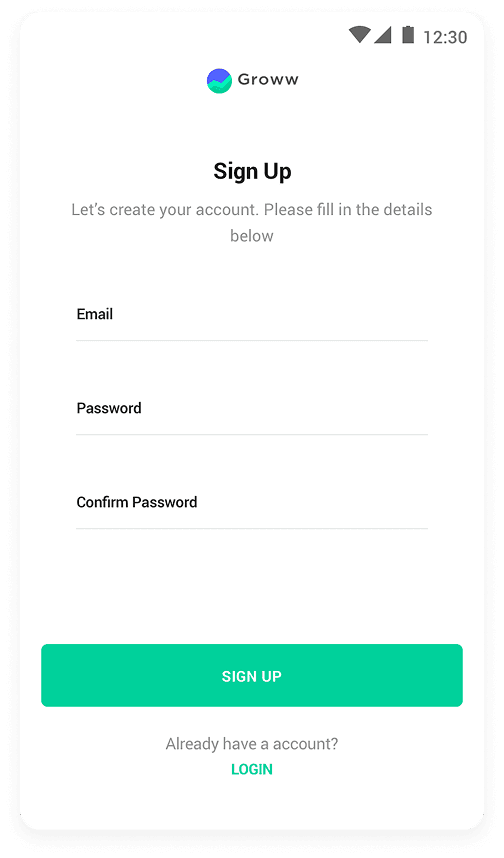
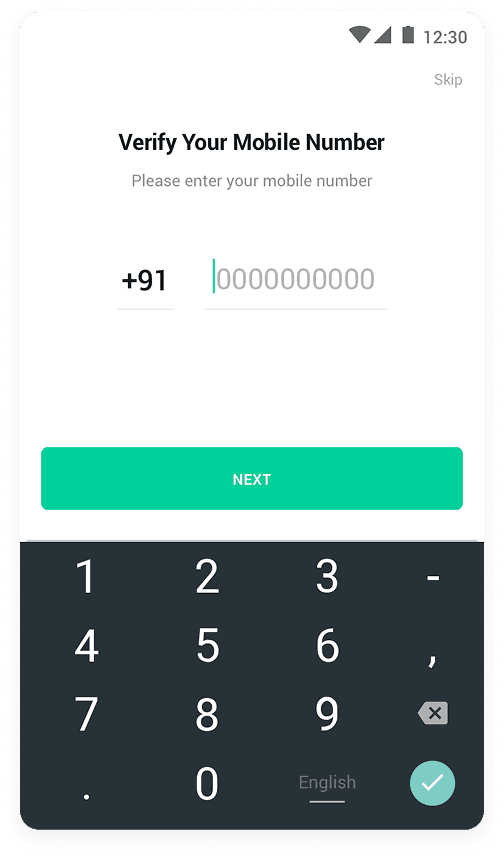
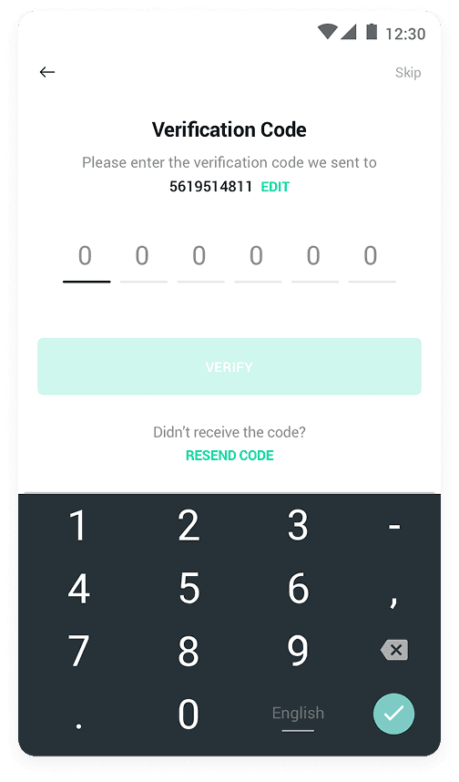
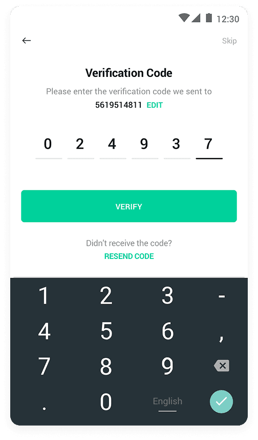
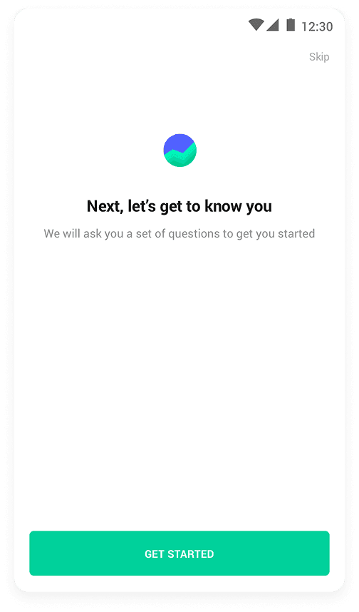
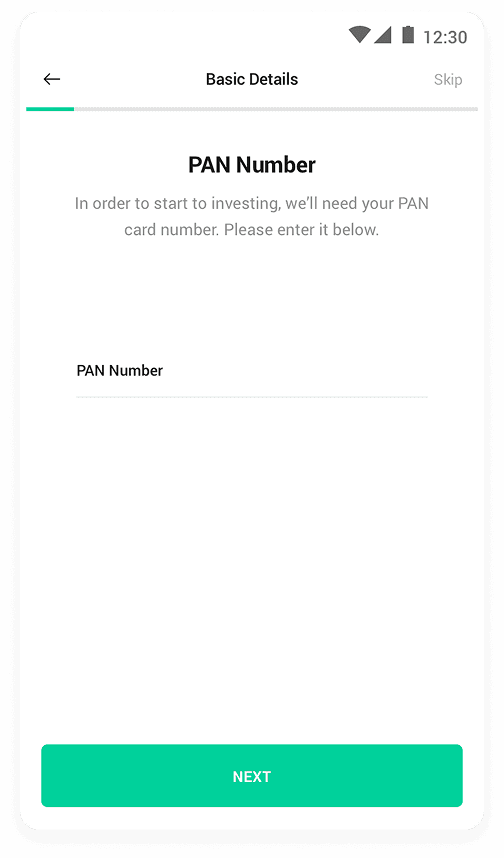
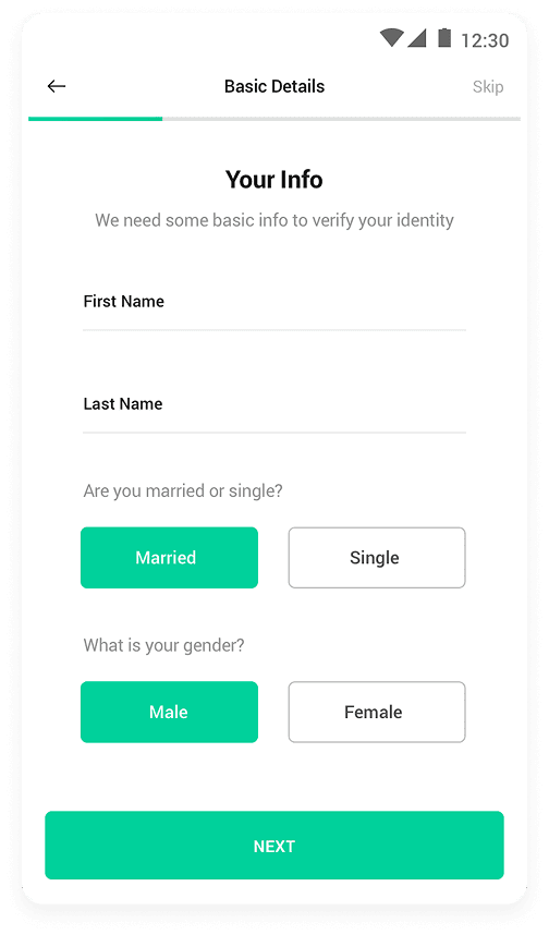
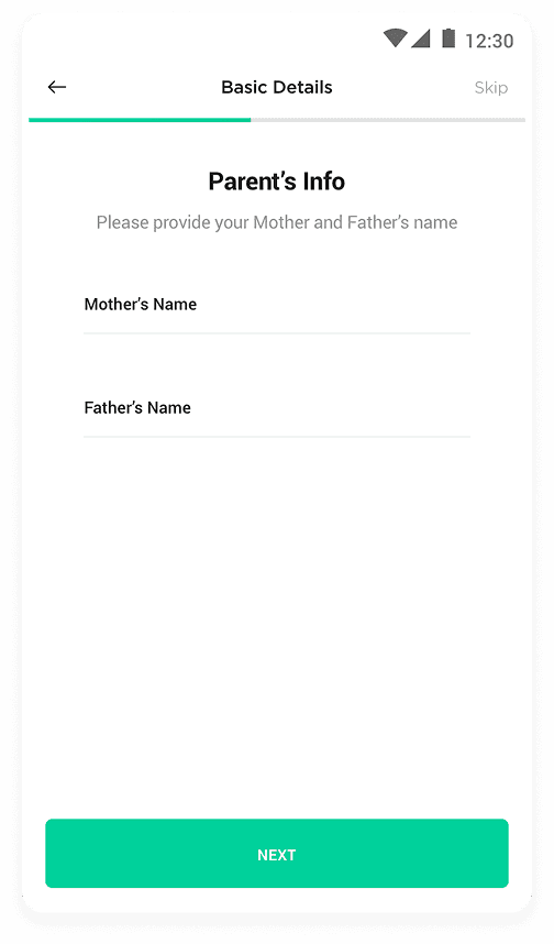
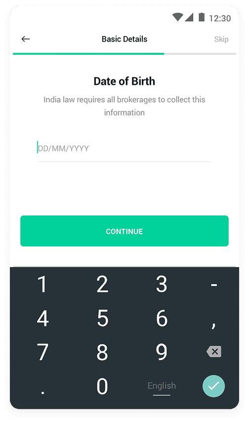
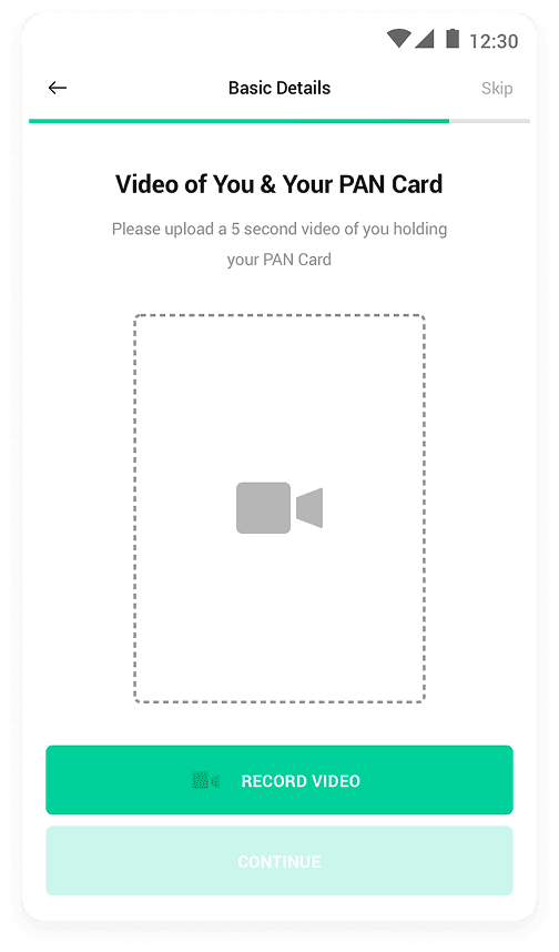
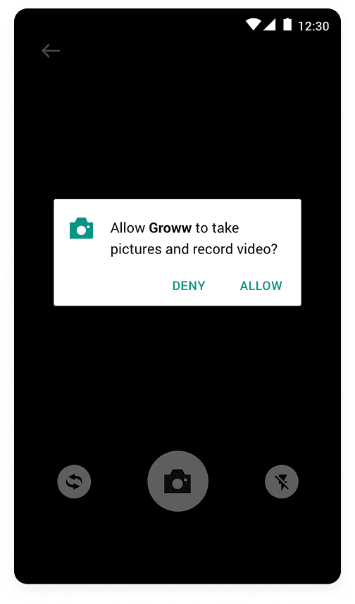
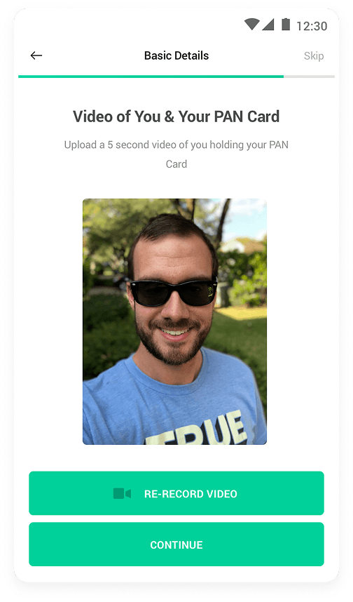
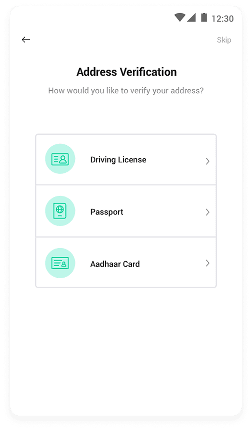
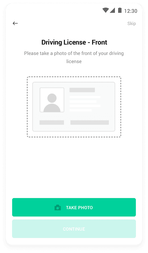
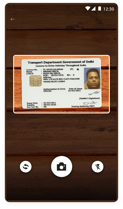
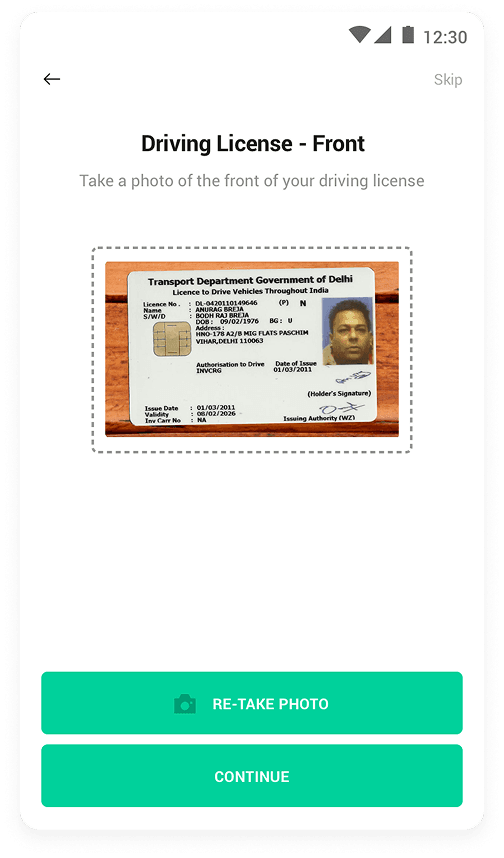
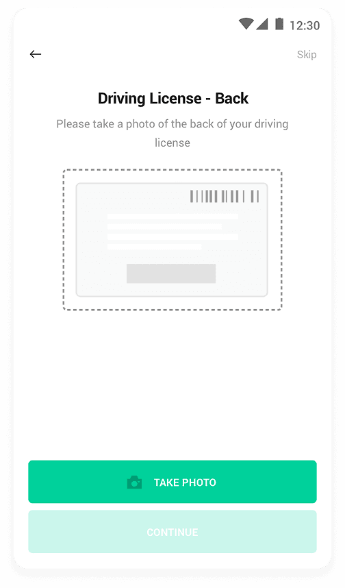
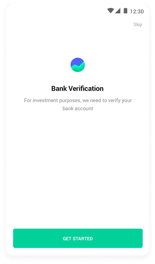
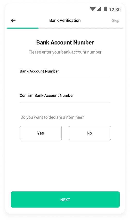
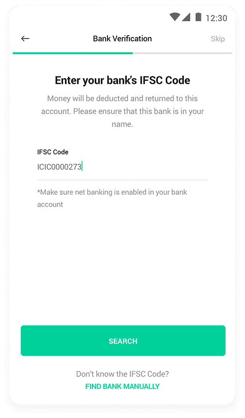
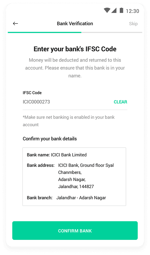
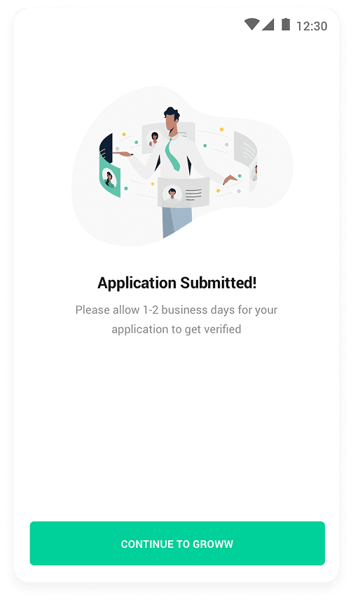
Streamlined onboarding
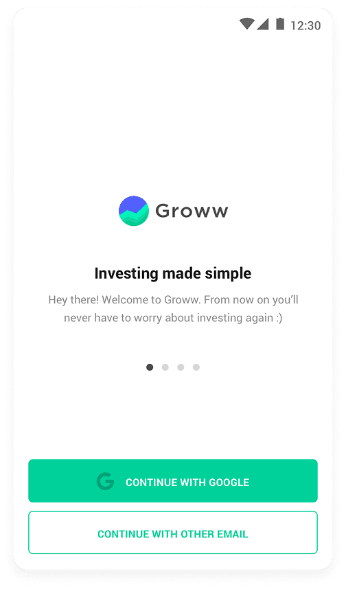
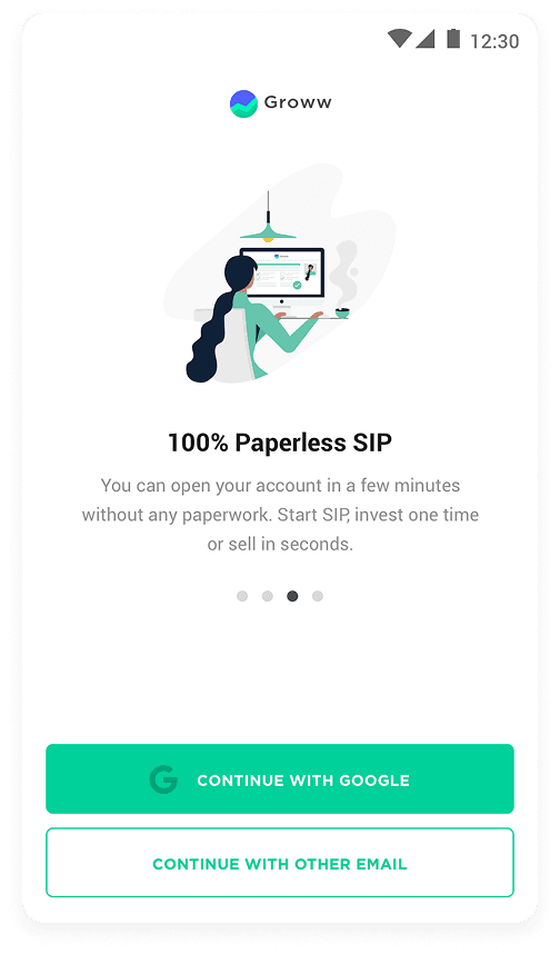
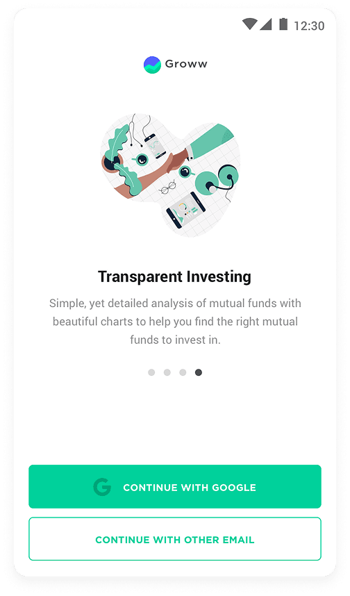
A revamped onboarding flow simplified the process, reducing redundant steps and guiding users through sign-up with greater clarity and ease.

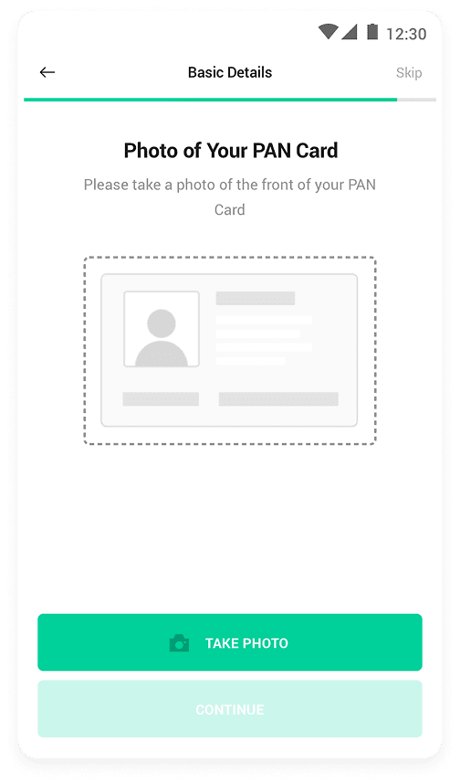
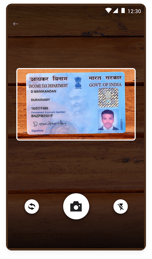
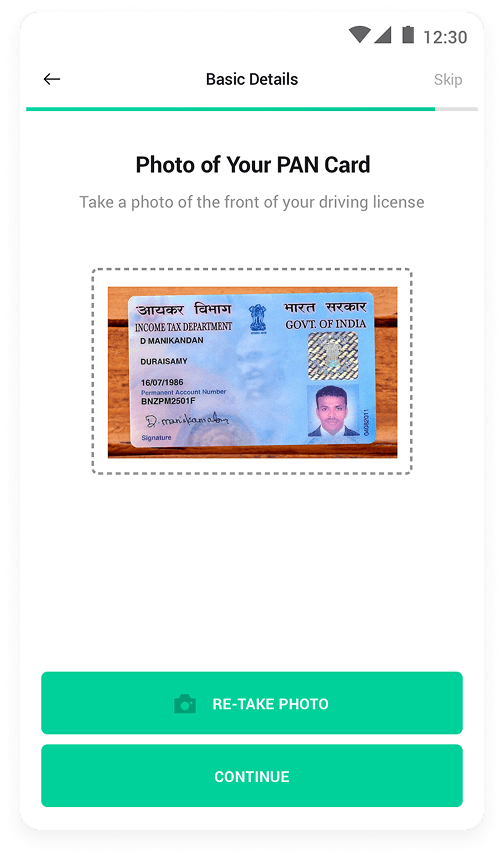
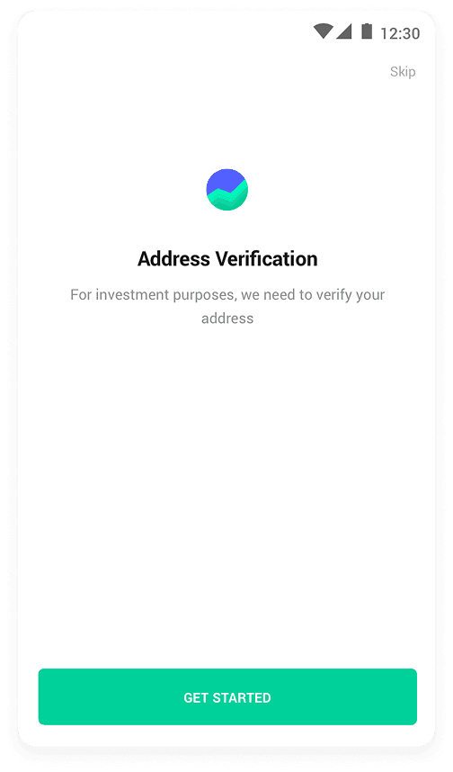


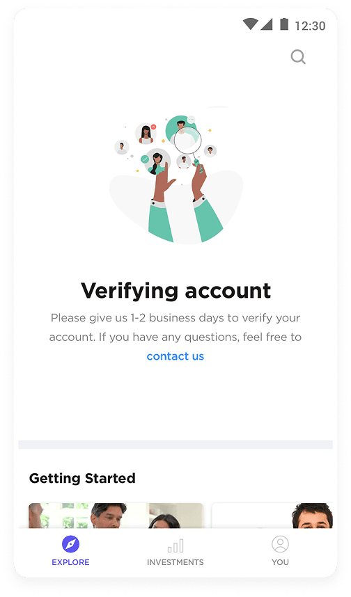
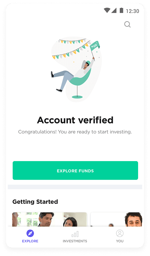
Clear Account Status Updates
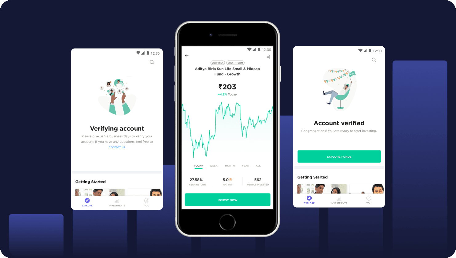
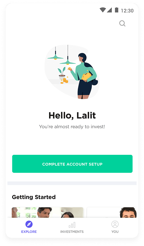
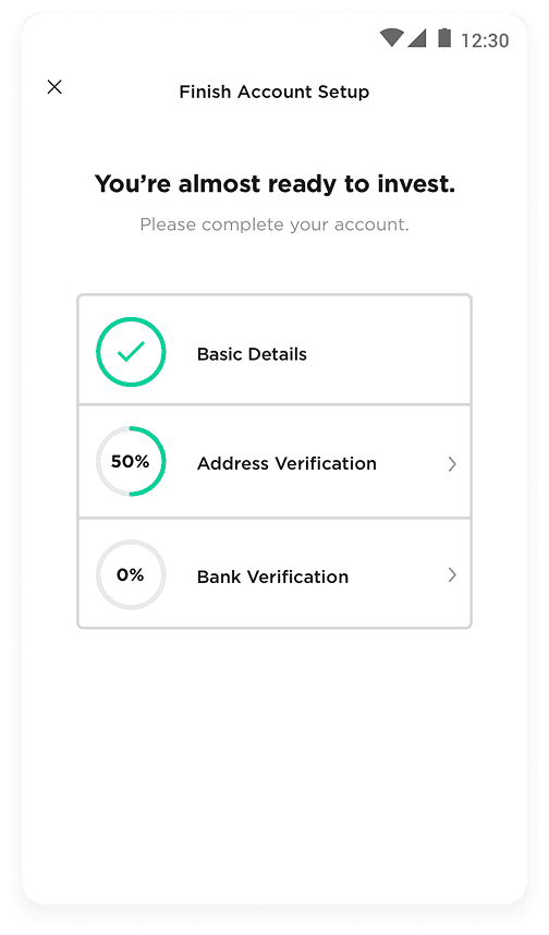
The redesigned homepage displayed real-time updates on the user's account setup and investment readiness, reducing confusion and customer service inquiries.
Pick up where you left off
If you skipped some of the onboarding steps, we now put your account status front and center to entice the user to finish setting up so they can invest.
Homepage catered towards the beginner
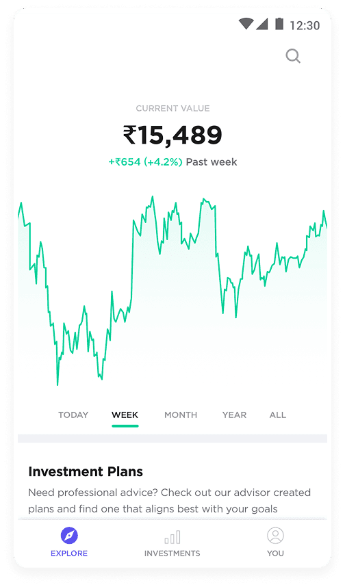
The first-time homepage was designed to help beginners feel oriented—pairing a clear setup CTA with getting-started guides, curated investment plans, market news, and FAQs so users could explore confidently before investing.

Results
A confusing onboarding experience that once stalled beginners was transformed into a clear path from sign-up to first investment, giving new users the confidence to get started.
40%
increase in user sign-ups
20%
increase in new users that invested
$Xm
in customer support costs saved
For confidentiality reasons, I have omitted the actual values for these metrics.